Is Your Home "Color Perfect? 


IN THE PALETTE OF LIFE, OUR HOMES ARE THE CANVAS,

AND OUR CHOICES FOR COLORS DEFINES US


Goal #1 - Paint is the backdop of the art of design  

                                                                                                                       Goal #2 - Paint should enhance the furnishings and fixtures                                     in the space                                                                                                                                                                                                                                                                                                                                                                                             

Why Use a Certified Color Expert?

For my clients who need help with color choices in their home, I consult with them on what color choices to make for paint, flooring, lighting, fixture, etc so that their home is "color perfect." Since half of all paint sales are generated from people picking the wrong paint, I will prevent my client from making this costly mistake, and instead create the perfect color scheme which will make you love your home even more! 

  • I know how hard it is to pick color. Color is complicated and not all colors get along.
  • I'll provide you with options, and you select what feels like you.
  • Colors affects our emotiolns, energy level, and sense of order. It sets the tone for making the space seem formal or informal, masculine or feminine, cooly aloof or warm and welcoming.
  • I'll provide you with a customized plan because it's not just about having the right paint color on walls...it's about how that color fits with your floors, trim, countertops, cabinets, and furnishings.
  • I'll alleviate those fears of picking the wrong color and take the stress out of "color perfecting" your home!

Sign up now!

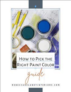
Pick the right paint colors for your home

FREE COLOR GUIDE


Pick the right paint colors for your home
My 6-Step Color Read Proces 

for a "Color Perfect" Home


1.
Identify Your Color Goals

I'll ask you about your color and design preferences, such as what is your color sensitivity, how do you define your home's style, what colors do you gravitate towards and which colors you have an aversion to?

2.
Listen to Your Home for Color Cues

What are your home space's architectural style, interior style, sun exposure, mood, use of the space, current color choices, existing furnishings and fixtures, color inspirations, etc. 

3.
Find the "Dictators" in Your Space

Dictators, or stars of the show, are focal points within a space and must be worked around because they are unchanging and unpaintable, such as flooring, counters/backsplashes, fireplace surrounds, and large furniture. I need to work your color scheme around these items.

4.
Identify Any "Showstoppers"

Showstoppers are fixed elements in a space that are nearly impossible to work around and wouldn't be considered to be inspirational. They must be designed around, such older appliances, busy solid-stone countertops, or older carpet.

5.
Follow Color Rules

Color is complicated!  There are at least 15 rules that relate to how color should be used in a space. Because color is so complex, it's easy to misread and make mistakes. Hire me to create color harmony in your home.

6.
Complete the Vision

Lastly, I'll pull everything together and provide you with a unique,customized color scheme for you home's space(s).  The result will not just be beautiful, deeply comforting, and invigorating, and one that will make you love your space even more! 

Six Common Color Mistakes

#1 Painting on Trend

Unless you want to repaint your rooms every 5-7 years it’s best to stick to a more timeless and blended neutral that coordinates and enhances the furnishings and fixtures in the space.

#2 Too Many Neutrals

Not all undertones go well with one another, so it can be dangerous to mix your beige neutrals. Instead, stick to 1-2 similar undertone neutrals in the space and add color for interestToo Many Neutrals


#3 Ignoring Fixed Elements

You don’t make color choices in a vacuum and must first consider the fixed elements in the space and how to connect the color to create cohesion otherwise it stands out and looks out of place.

#4 Not Repeating Color

Make sure to repeat your accent colors throughout the space to draw the eye and connect your scheme. The navy blue is repeated beautifully in this award-winning Houzz living room.


#5 Too Many "WOW" Features

It’s tempting to go bold on your kitchen/bath finishes but it’s best to stick with one, bold fixture star. Otherwise the patterns and colors become overwhelming as in this kitchen to the left.

#6 Choosing Paint First

When it comes to a well-designed room, the paint should be chosen last as the backdrop that brings the elements in the room together and enhances the space. 

Painting Tips

A.
Tip #1

Determine the best type of paint for the project.

B.
Tip #2

Remove any dirt or dust from your walls using water or a diluted dish detergent.

C.
Tip #3

Use a brush and paint around these areas first - ceiling line, corners windows, doors, moulding, outlets, and switches.

D.
Tip #4

Don't saturate the roller with paint.  Dip your roller into the paint and roll to distributer paint evenly.

E.
Tip #5

Store paint in an area out of direct sunlight. Ideal temperatures for storing paint are 60 - 80 degrees F.